
Italian sun, international luxury
.jpg)

Advertising footage delivered
Social and ad videos produced
Final photographs delivered
Challenge
Don Vitantonio Wines approached Cambridge Chronicles with a blank canvas. No established audience, no visual identity, only a driving ambition to position the brand within the international luxury market. While thrilling, it is also an immense responsibility as every creative decision would shape the very first impressions of the brand.
The challenge was to establish a distinctive identity: rich, luxurious, aspirational. Each shot, each location needed to reinforce the story of the wine rather than compete with it.
Equally important was defining the emotional proposition behind the brand. Before creating the imagery, we needed to answer a more fundamental question: who is this wine for and why should they care? The result had to communicate authenticity and craftsmanship through a consistent visual language that could scale across advertising, social media, e-commerce and future campaigns.
.jpg)
.jpg)
.jpg)
.jpg)
.jpg)
Our Approach
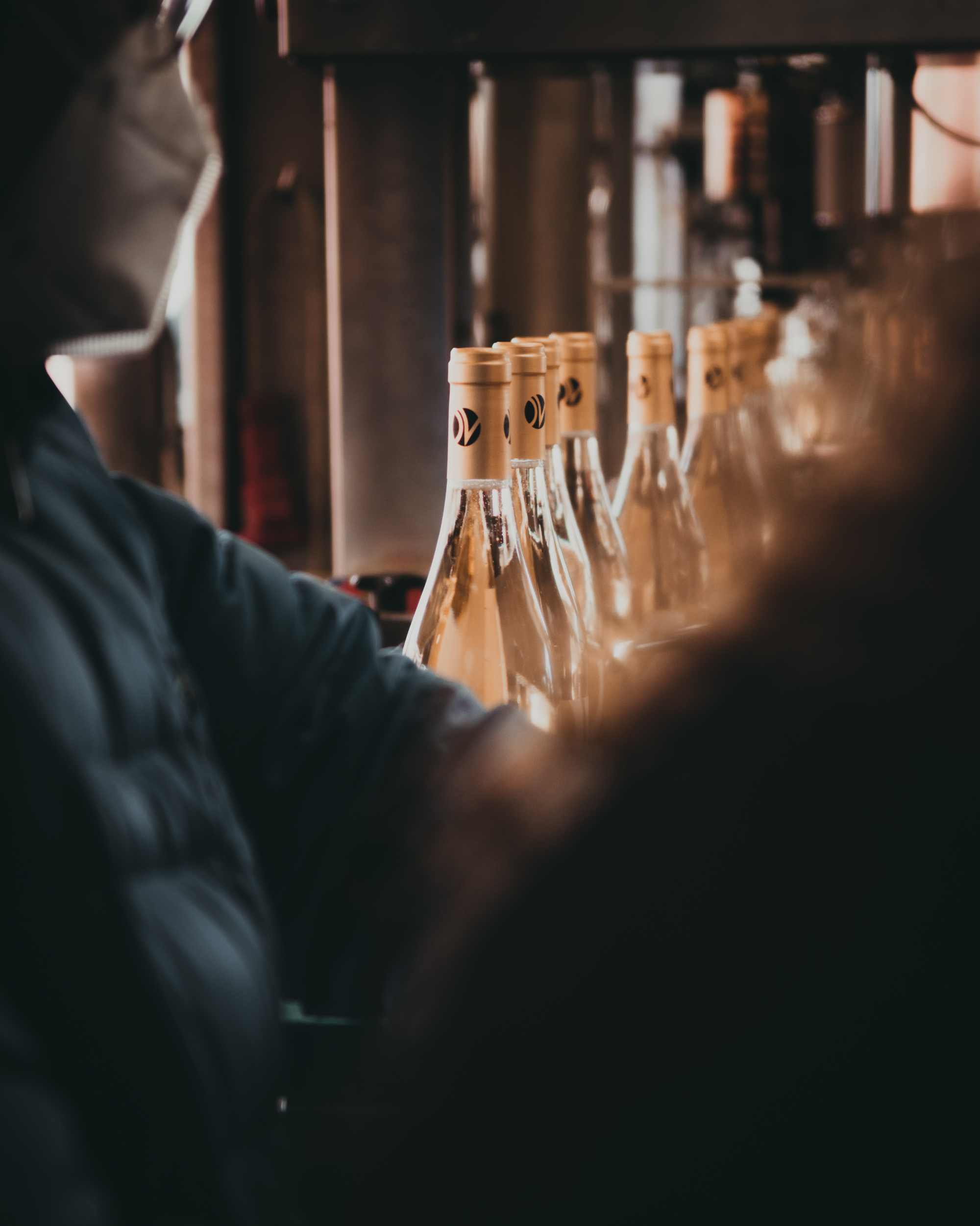
We developed the creative strategy around a single guiding idea: the Italian lifestyle as something aspirational, warm, effortlessly elegant. We chose to hero the bottle and let it tell the story of the fabled Italian warmth, the light and the terroir.
Drawing inspiration from the restraint and confidence of the world's leading luxury brands, we created a visual language centred on natural light, refined composition and cinematic storytelling, always allowing the bottle to remain central to every frame.
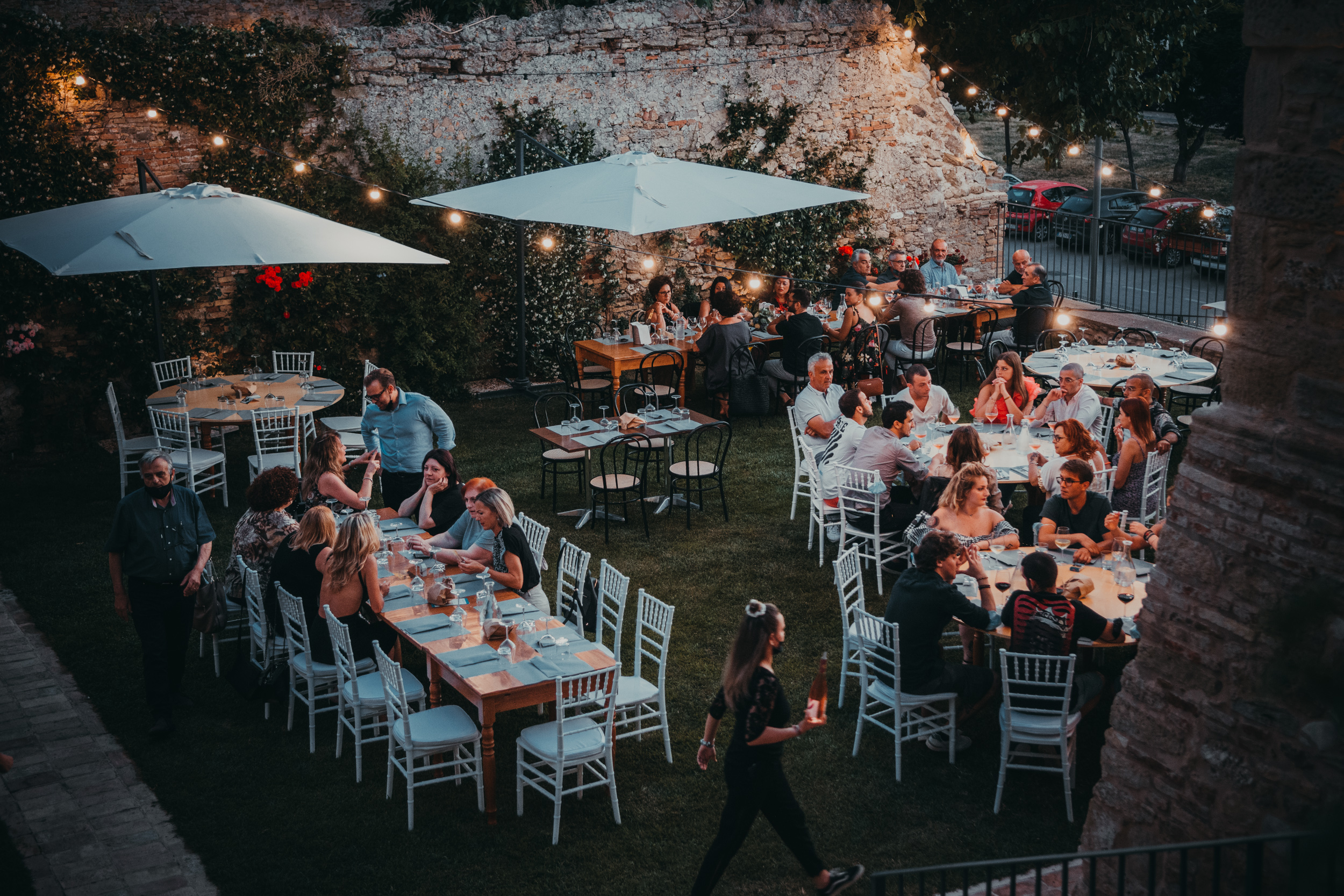
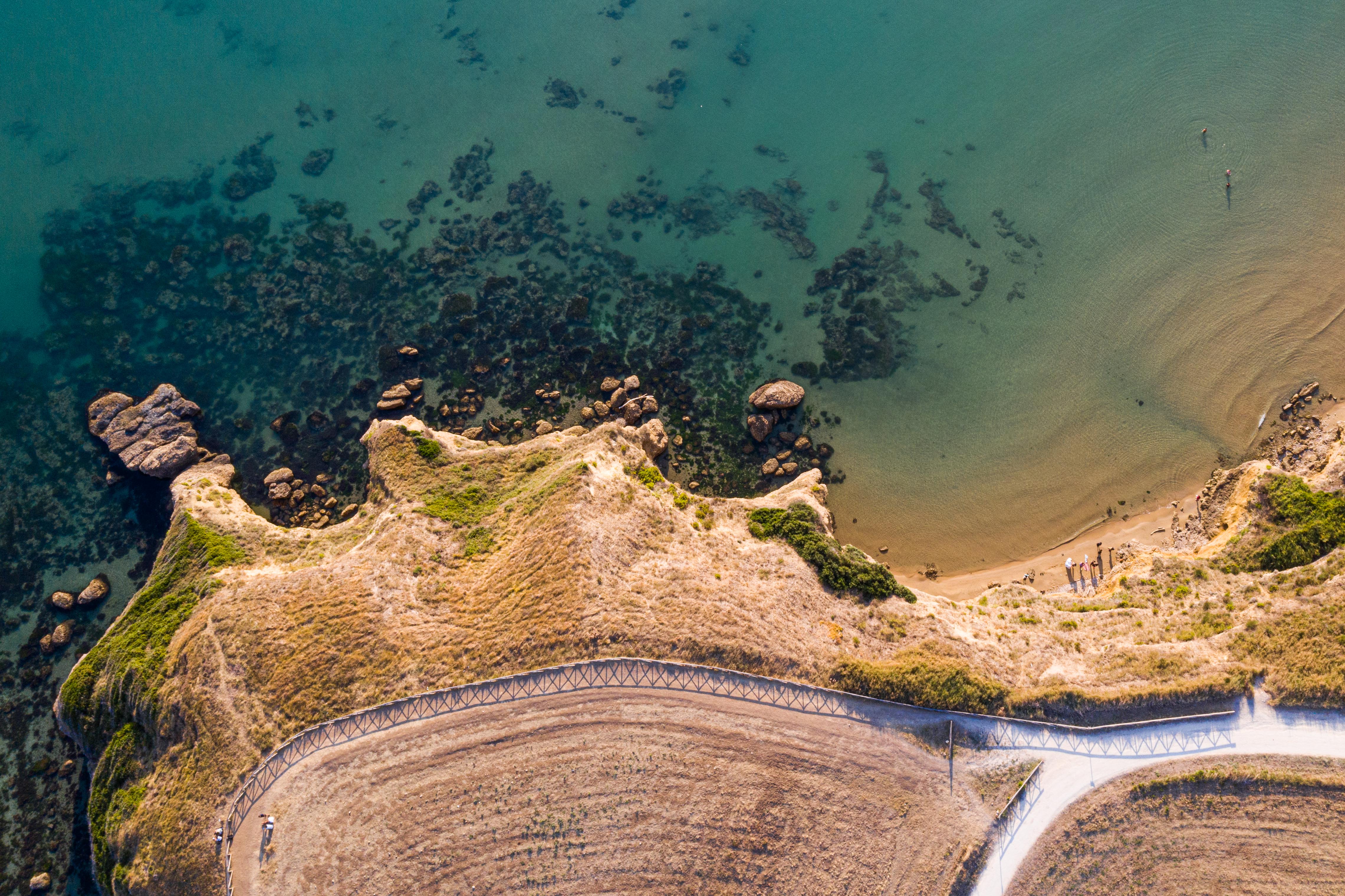
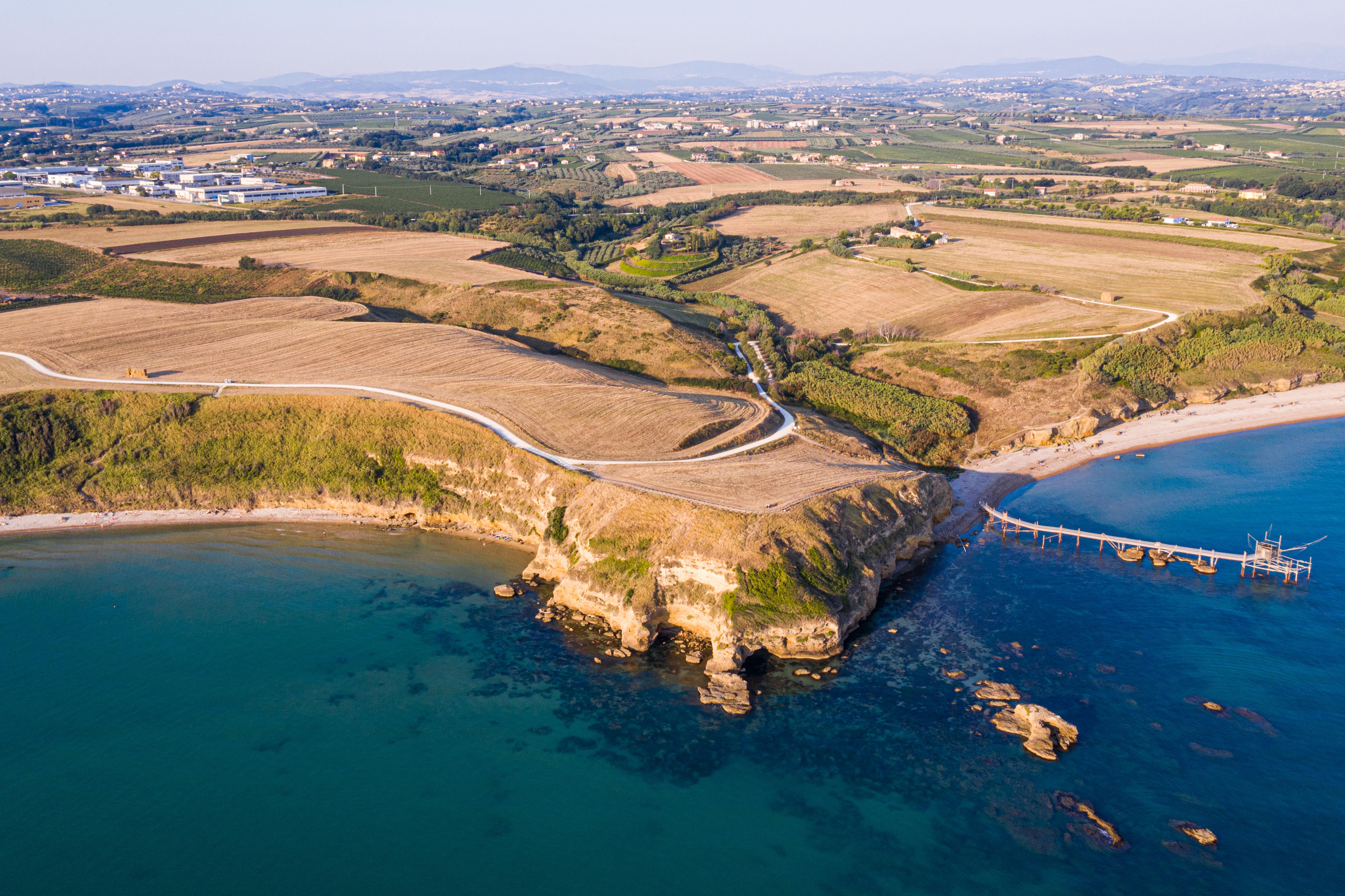
We shot across four carefully selected Italian regions, each contributing a distinct chapter to the brand narrative. Abruzzo established authenticity and provenance, Tuscany conveyed heritage and prestige, Sicily celebrated wine culture and Mediterranean warmth, while Rome added scale, sophistication and international appeal.
Throughout production, we balanced meticulous planning with creative spontaneity, incorporating local people and authentic moments wherever they strengthened the story. Meanwhile, footage and imagery were continuously shared with our post-production team in Cambridge, enabling an efficient workflow and maintaining creative consistency across the campaign.
.jpg)
.jpg)
.jpg)

The Outcome
Don Vitantonio Wines launched with a distinctive luxury identity that feels unmistakably Italian.The project delivered a versatile content library that continues to support advertising, social media, website content and future marketing initiatives, providing the brand with a strong visual foundation for long-term growth.
The programme encompasses:
- Brand strategy and creative direction
- Commercial photography
- Cinematic brand films
- Lifestyle campaign production
- Multi-location international content creation
- Marketing asset library
A Distinctive Luxury Identity
A cohesive visual language positions Don Vitantonio Wines as a premium international brand, combining authenticity with understated luxury.
Cinematic Brand Storytelling
Photography and film work together to communicate atmosphere, craftsmanship and aspiration while ensuring the product remains central throughout every campaign.
A Scalable Content Library
A comprehensive collection of photography and video assets provides the flexibility to support digital marketing, advertising, social media and future product launches.
Strong Brand Perception
The campaign established an immediate premium presence, with client feedback describing the work as "mind-blowing" and audiences responding positively to its unmistakable sense of luxury and Italian character.


.jpg)
.jpg)


